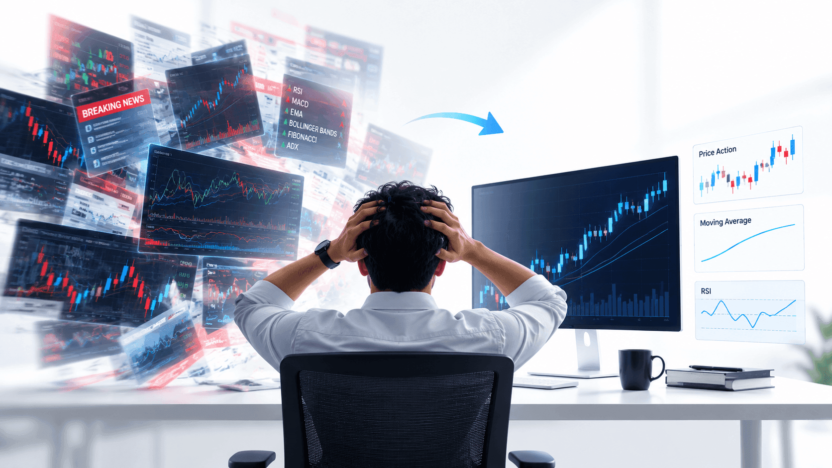


To the untrained eye, a trading chart can look like a chaotic mess of lines, bars, and colours. But to a trader, it is a map of market psychology, supply and demand, and potential opportunity. Learning to read these charts is the first step toward making informed trading decisions rather than relying on guesswork.
Whether you are interested in Forex, stocks, or commodities, the price chart is your primary tool for understanding where the market has been—and where it might be going next.
Why Visual Data Matters
Trading is ultimately about data processing. Every second, thousands of transactions occur globally, driving prices up and down. A price chart condenses all that complex data into a simple visual format.
By visualizing price action, you can quickly identify:
-
Market sentiment: Are buyers or sellers in control?
-
History: How has the price reacted at this level before?
-
Volatility: Is the market calm or moving aggressively?
The Basics: X-Axis and Y-Axis
Before you can interpret complex patterns, you must understand the grid itself. Every standard price chart is built on two axes:
The X-Axis (Time)
Running horizontally across the bottom, this represents time. As you move from left to right, you are moving forward in time. The specific timeframe depends on your settings—each data point could represent one minute, one hour, one day, or even one month.
The Y-Axis (Price)
Running vertically up the right side, this represents the price of the asset. If the line or bar moves up, the asset is becoming more expensive. If it moves down, it is becoming cheaper.
Types of Charts
While there are many ways to display market data, three types dominate the trading world.
1. Line Charts
This is the simplest form. It connects a series of data points (usually the closing prices) with a continuous line. It provides a clean, noise-free view of the general trend but lacks detail regarding what happened during the trading period.
2. Bar Charts
Bar charts offer more detail. Each vertical bar represents a specific period. The top of the bar is the highest price reached, and the bottom is the lowest. Small horizontal notches on the left and right indicate the opening and closing prices, respectively.
3. Candlestick Charts
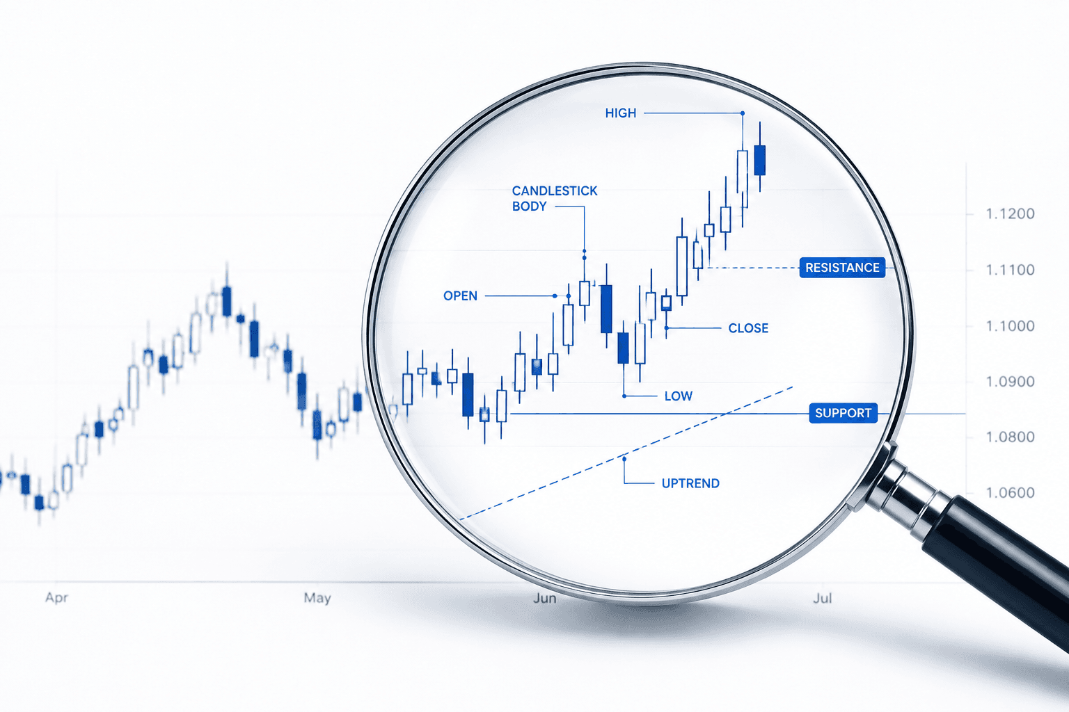
This is the most popular chart type among traders. Like bar charts, they show the open, high, low, and close prices, but they use a coloured "body" to make the relationship between the open and close instantly visible.
Reading Candlesticks
To interpret a candlestick chart, you need to look at two main components: the body and the wicks (or shadows).
-
The Body: The wide part of the candle. It illustrates the range between the opening and closing price.
-
Bullish Candle (Usually Green or White): The close was higher than the open. The bottom of the body is the open price; the top is the close.
-
Bearish Candle (Usually Red or Black): The close was lower than the open. The top of the body is the open price; the bottom is the close.
-
The Wicks: The thin lines sticking out above and below the body. These show the extreme high and low prices reached during that time period, even if the price didn't stay there.
Spotting Trends
Once you can read individual candles, you can start connecting them to see the bigger picture—the trend.
-
Bullish Trend (Upward): The chart shows a series of "higher highs" and "higher lows." This indicates that buyers are in control and demand is increasing.
-
Bearish Trend (Downward): The chart displays "lower highs" and "lower lows." This suggests sellers are dominating and supply is exceeding demand.
-
Sideways Trend (Consolidation): The price moves horizontally within a specific range, indicating indecision in the market.
Using Technical Analysis Tools
Reading the chart is just the beginning. At My Maa Markets, we provide access to the MetaTrader 5 (MT5) platform, which allows you to overlay technical tools directly onto your charts.
By using indicators like Moving Averages or Bollinger Bands alongside your basic chart reading skills, you can confirm trends and identify potential entry or exit points with greater precision.
A Note on Risk Management
While charts provide valuable insights, they do not predict the future with 100% accuracy. Markets can be unpredictable.
-
Trading involves significant risk: Never assume a pattern will play out exactly as the textbook says.
-
Invest wisely: Only trade with money you can afford to lose.
-
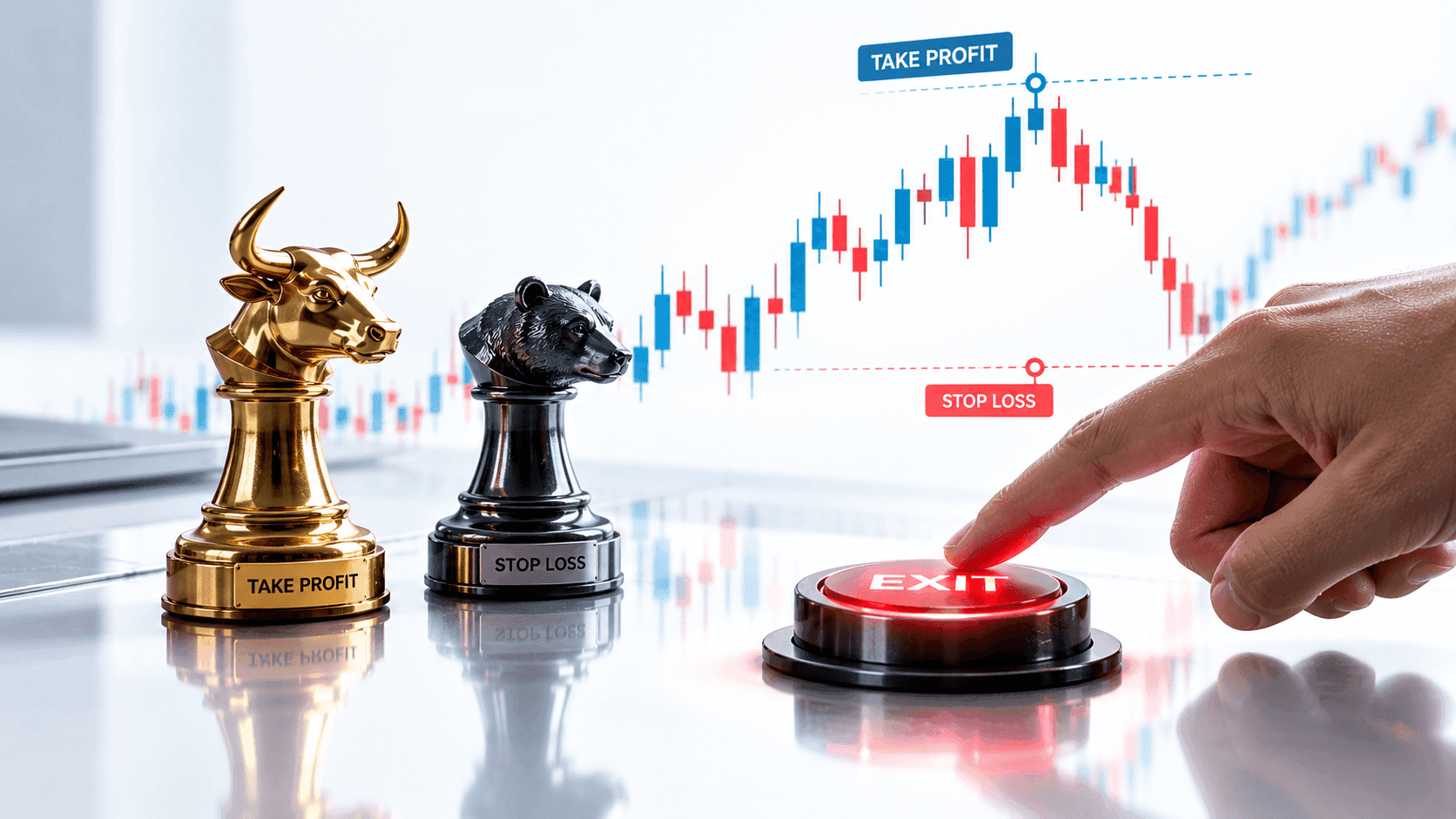
Use stop-losses: Protect your capital by setting predetermined exit points if the market moves against you.
Start Charting Today
Understanding price charts is a skill that takes practice, but it is the foundation of successful trading. The best way to learn is to look at live markets yourself.
At My Maa Markets, we offer an FSC-regulated environment where you can practice these skills. You can access global markets with spreads from 0.0 pips and zero commissions on our Standard account.
Ready to test your new skills? Open a demo or live account today.